

It's day 3 of our week long stamping contrasts series - we do hope you're having as much fun as we did as a DT getting together to bring this series to you.
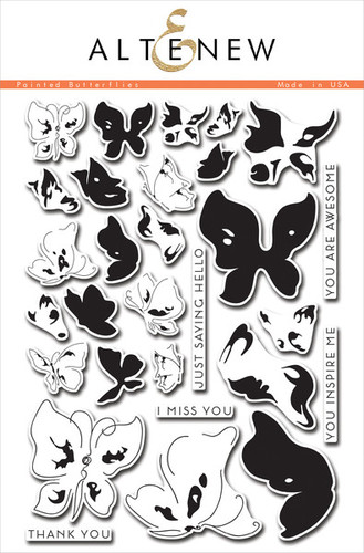
For our contrast today - Keren and Sarah are showing you what a difference colour can make - you can achieve such a different look from a set like Painted Butterflies by playing with Colour VS Monochrome.


Keren
Colour is definitely the easier one.. I wanted to do something really bright without it being 'rainbow'. We had both picked 'Painted Butterflies' by Altenew and I wanted to showcase the little butterflies in the set. I had the idea of them flying beyond the card and so cut out an acetate hollow heart shape. I folded it in half and then started to add the butterflies. These are a 3 step inked stamp- and trust me, this set is so forgiving, you won't need to worry if they're precisely lined up.
Once I'd stuck them all down, I added foam pads at different stacked heights so the heart would remain folded on the card and then added a thin strip of acetate in the middle to rest the white embossed sentiment onto.
Sarah
Isn't Keren's card spectacular?! Initially I scratched my head in terms of how I could use the layered butterfly stamps from Altenew in a black and white design. Black on black would just look like a smudge :) I decided to stamp the butterfly in Black Soot Distress Ink on watercolour card. I didn't stamp all of the layers and tried my hand at watercolouring to give the butterfly some dimension and interest. I splattered some ink in the background and added a sentiment from the same set. The central panel is die cut with a Lawn Fawn stitched square and matted on black card. I think it came out quite atmospheric and a real contrast to Keren's gorgeously vibrant (and dimensional) design.
Have we inspired you to join in the fun?
If you fancy having a go and challenging yourself to stamp a contrast along with us then link up your entry below - just pick a contrast from any we'll be demonstrating this week and make your own. You could either make 2 cards to show the contrast or just choose one of ours and make the contrast to match it (so choose Keren's colourful card and make a monochrome one like Sarah did with whatever stamps you have) We'll leave the link open for a week after our final post on Saturday so you have time to see all the contrasts before picking one to join in with and then have a full week to play. You never know, we might even find a prize for the best contrast ;-)
5 comments:
OMG girls! Keren, you never cease to amaze me. That is the most fantastic rabble of butterflies I've ever seen on a card! And Sarah, that image is of course gorgeous, but how you've watercolored it and added splatters made it so perfect for a B/W card. Must check out your previous posts. What a great idea for a series.
Both cards are gorgeous!!! Love how the butterflies extend of your card Keren and the B&W version is stunning too Sarah :)
Wow! It really just shows that you can make different styles of cards from the same stamp set. (But you got to be clever to do so too!! ^_^) These cards are just amazing!!
Gosh, both are beautiful cards but I really love the contrast of the card with the grey tones, just beautiful and really quite poetic with the sentiment the butterfly has been paired with.
Amazing work ladies, I love being on a team with such fabulously creative people :D
Kate xx
Post a Comment